Crystal Clear
UX Design / Coding
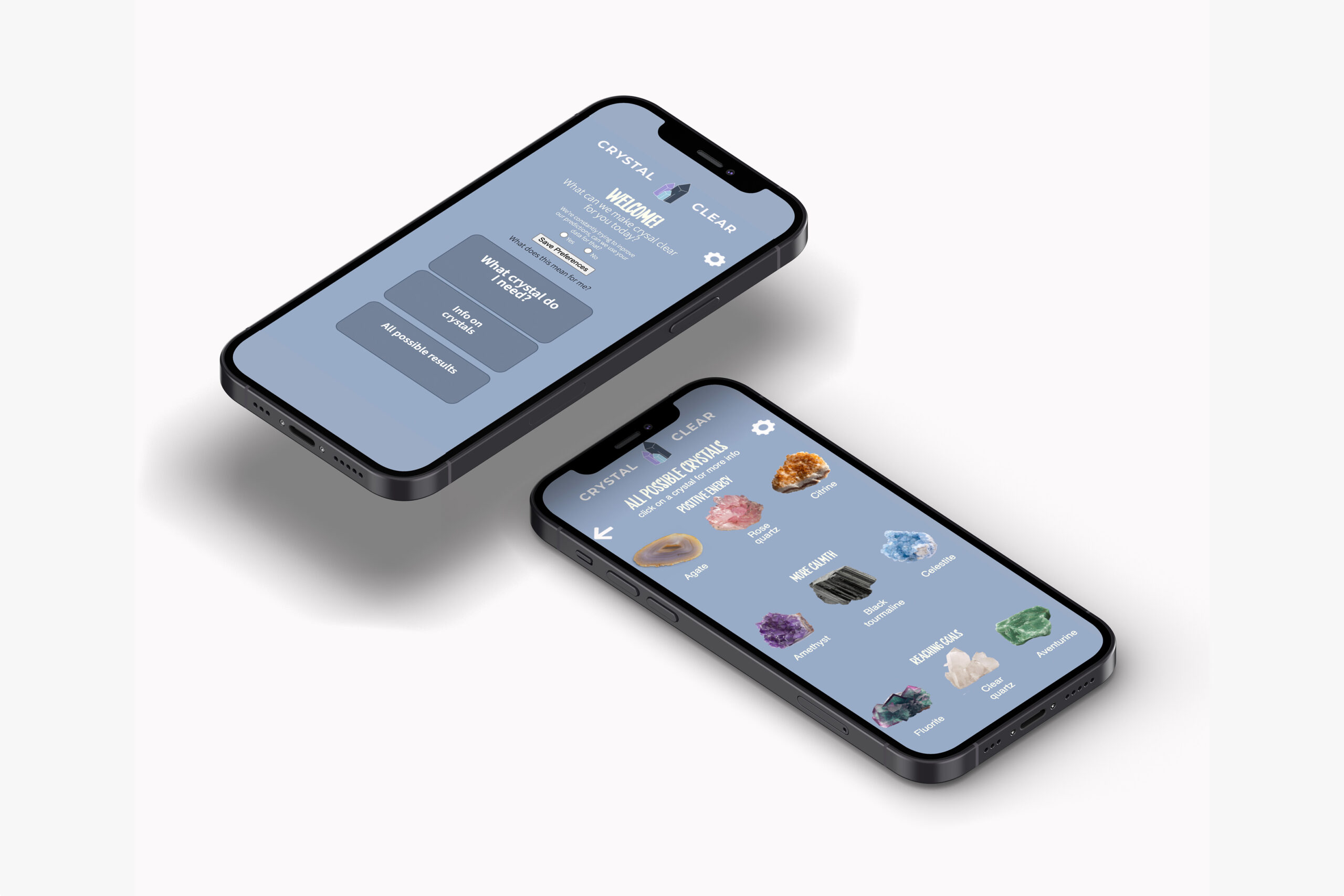
Crystal Clear is an app designed in 2021 that uses a neural network based on gathered data to give the user a prediction on what crystal they might benefit from. The neural network was provided to me by Avans. The data used to teach the neural network was personally gathered and analysed to check it’s usefulness. This app was the first time I consciously used UX principles / heuristics in an app and used UX research methods to gain an idea of the users needs.
The heuristics implemented were transparency to prevent the black box principle for the users, thinking and being clear about ethics and using nudging to encourage the user to make use of the prediction. For the UX research a PACT model was used, a persona create and a user journey created. (As seen below)
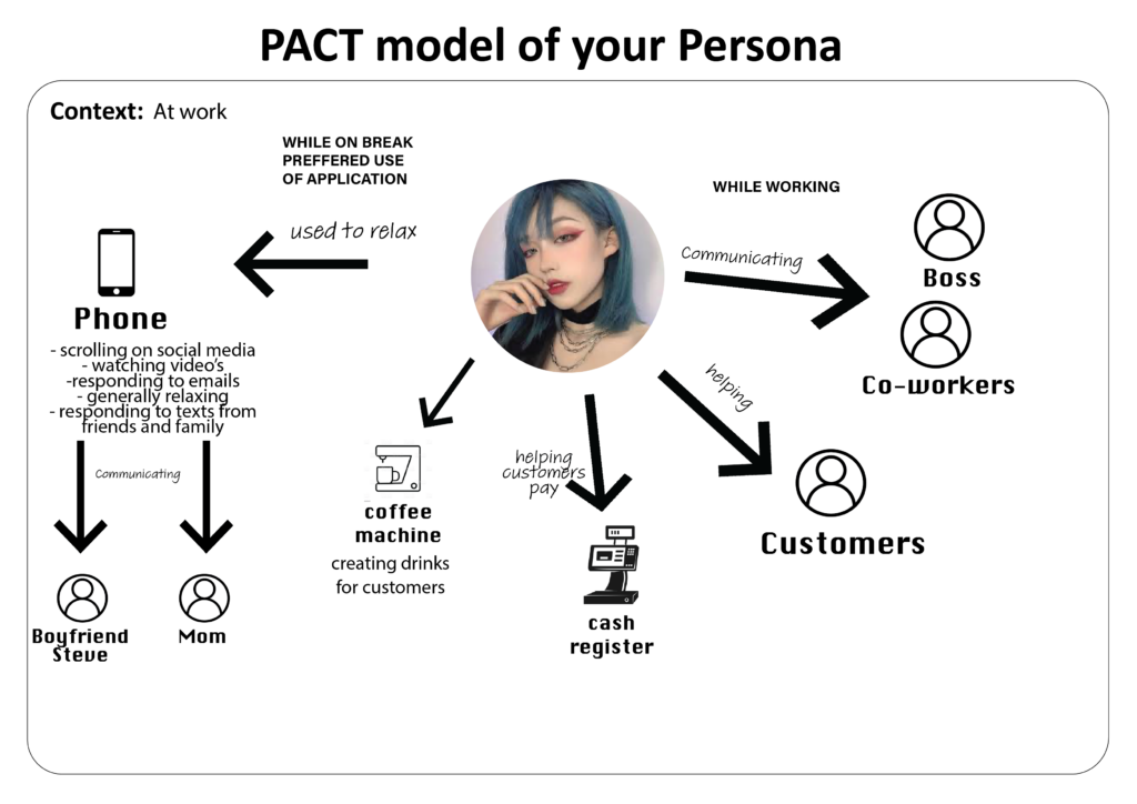
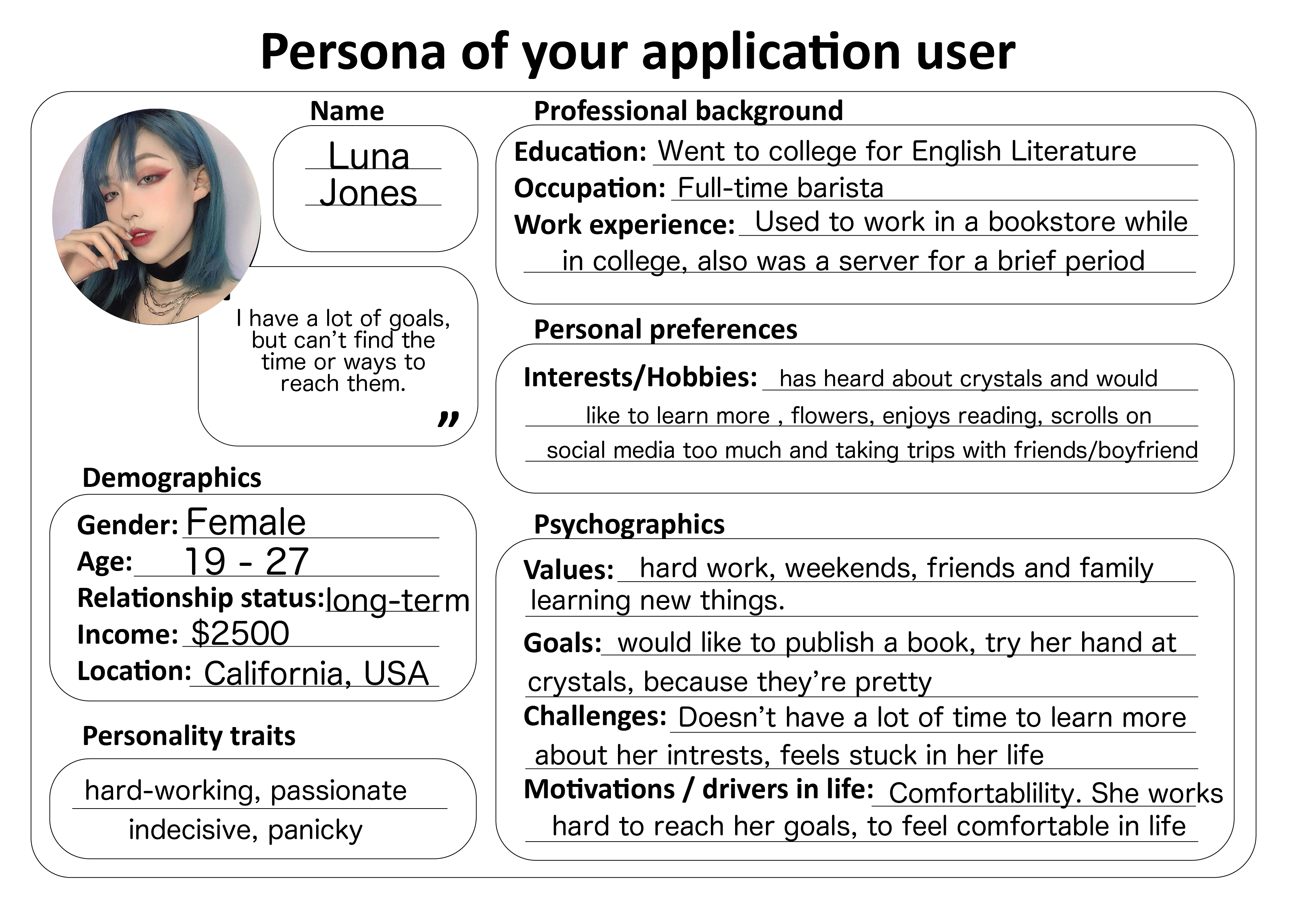
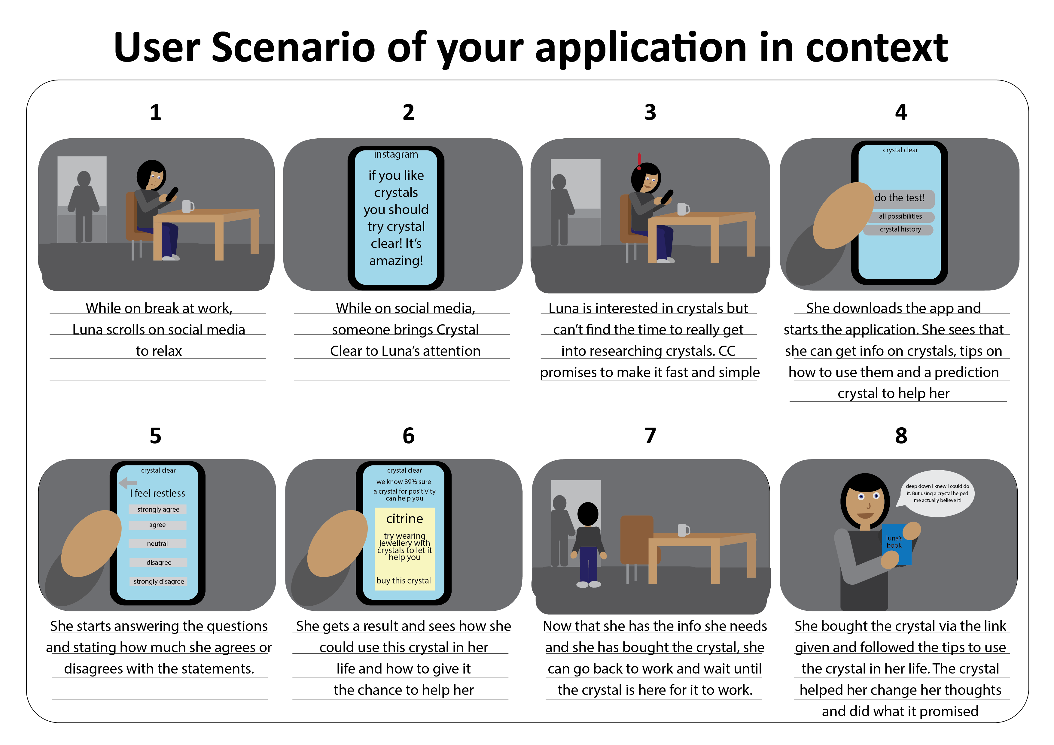
With gathered information through these methods, I was able to design for a clear context and user. Deciding on when and where the app should be used also enabled me to make certain design choices. In this case choices had to be made to create a simple and easy design so that it could be used in a short amount of time. The information had to be continuously accessible, so the user could get to the information when they had more time.
Crystal Clear walkthrough and prediction testing.
In the final design, the UI could leave some things to be desired, but taught me a lot about UI. The heuristics can be found within the app. To be transparent about data, there’s an entire page about what happens with users information and why it is needed. The user has the option to enable to use or not use their data. For the ethics (UX or otherwise) a disclaimer has been added. This lets a user know that Crystal Clear does not claim that crystals will heal, but could help dealing with some personal problems.
The nudge is also something the user can opt out of. When the user gets a prediction, a link has been added at the bottom of the page. This link connects to a page where the user can get the crystal. This lowers the bar for the user to start using crystals, but never forces them to do anything they don’t want to.
This design taught me a lot about UX and UI. The result connects to my interests and my way of designing, but the proces is more valuable to me here. It may seem obvious, but it taught me to understand the user and it’s needs before starting the design. It’s also important to understand the role your design will play in the users life. This way you can make design choices that connect to everything you’ve established early on.

