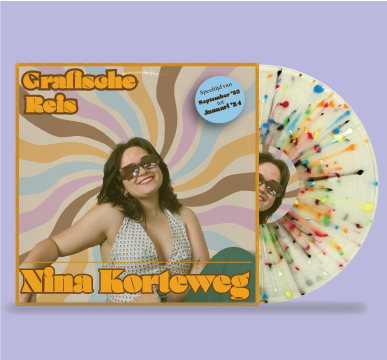
Grafische Reis
Graphic Design
This assignment was designed for my minor Graphic Design at Fontys Hogeschool in Tilburg. The assignment was given for students to reflect on the minor and everything they have learnt. The form of the assignment was free, but you had to have a reason for the chosen form. For me, I love the entire aesthetic of the 70’s, plus I personally collect records. The form of the design connected to me as a designer and I wanted to create something where it all depended on the graphic design of the assignment, since I already had experience with the Adobe creative suite.
To get an idea of what I wanted te record to look like, I did some research on vintage looking records. Based on this research I was able to get an idea of the colours I wanted, plus certain elements that were necessary for a record. I also looked in my own collection at more recent records and what elements I enjoyed about the records I own.
After all this research I had an idea of the general look of the record. I created a colour palette by looking at the colour psychology of certain colours, and if they fit with the 70’s vibe I wanted to achieve. Once the colours were chosen, I look at typography. I wanted a font that evoked the 70’s, but was not the bubbly font that everyone thinks about with the 70’s. I found a font I thought fit the bill. I used this as a title font, and found an interesting, but neutral font that could be used for the written text.
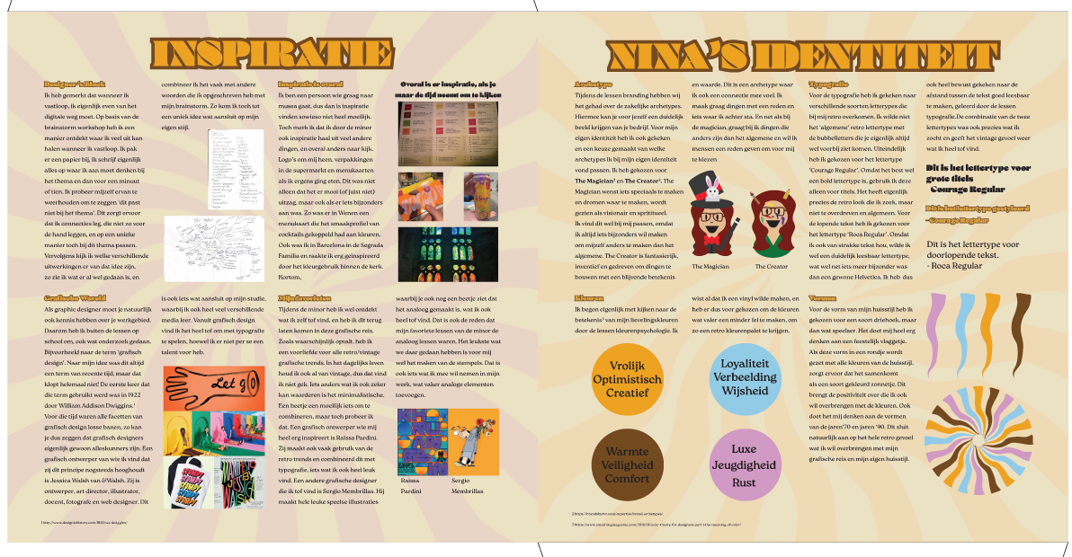
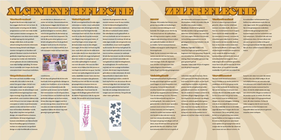
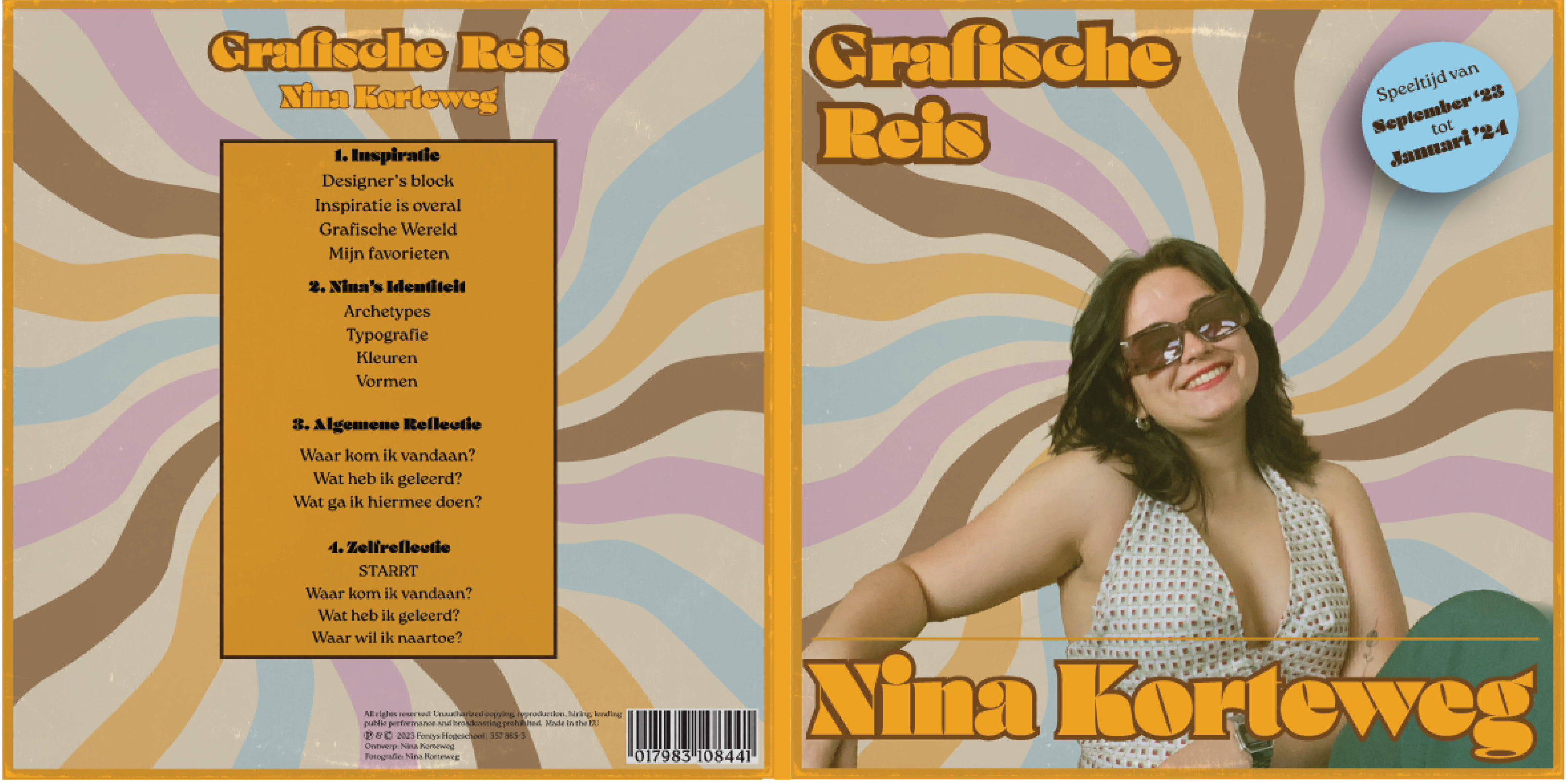
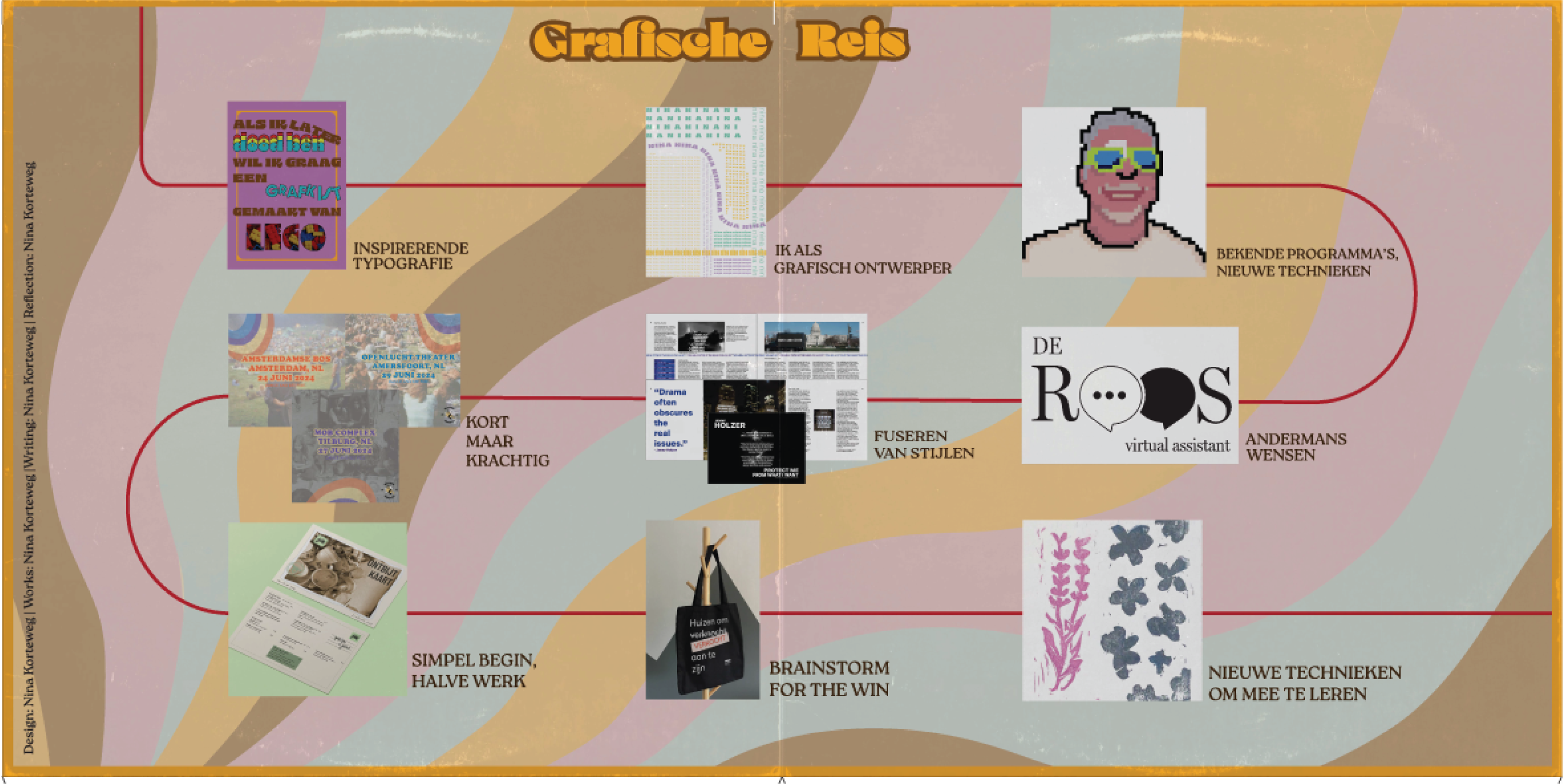
All the separate pieces of the record, not placed in the template.
The entire style of the record was set. I had done plenty of research to know what I wanted, but I created multiple covers in multiple different styles. Once I had a few I liked, I picked the one I felt most connected to my design style. I created a back cover with the needed information that connected to the cover. I put my graphic journey on the inside of the record and the written reflection on the inner sleeves that held the actual vinyls. I also created a template that I had printed. Once it had been printed I could fold and glue it together to form the record sleeve. Once everything was put together, it looked like an actual record.
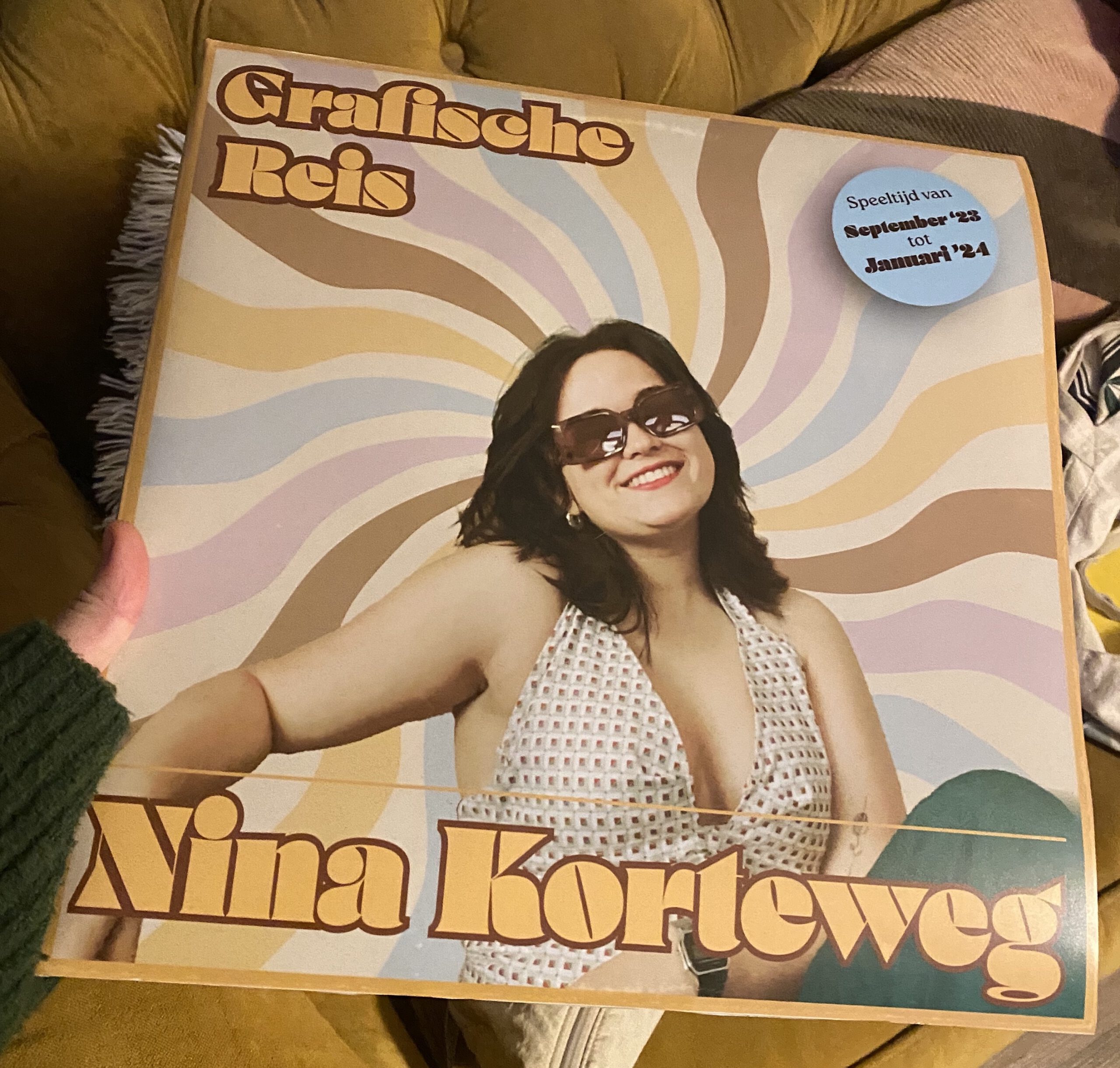
The final printed version of the record.
I’m very proud of the final result and it looks like a realistic record. Based on the feedback I received I know there are small details that could make the design perfect, but overall I think it looks amazing.

