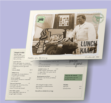
Broodcafé Jaap Menukaart
Graphic Design
This design is a personal one for me. My parents have their own lunchroom. For a school project I needed an assignment, so my parents asked if I could redesign the menu for our lunchroom
The old menu we had didn’t align with the aesthetic of the lunchroom. I had a clear idea of what the aesthetic was, but I had to make it clear to my group mates for this project. I took photos of items in the lunchroom that showed the aesthetic in the interior design. I put all these photos together in a mood board and sent it to the rest of the group. We decided to all brainstorm a few ideas and later come together to decide what concepts we would work out.
One of the teammates came up with the idea of a handwritten postcard. We worked out two other ideas, but the customer thought the postcard was the best idea. I was the designer tasked with working out the design. I looked at vintage postcards and took some of the photos from the mood board to use on the front of the menu. My father comes from a long line of bakers, which is something I believe we should be proud of. I asked my aunt for a photo of him to use on the menu.
For the font, we started off with a vintage handwritten font. When printing one of the iterations, we realised that it’s not a good font for a smaller size. The lunchroom often has some customers that are a bit older, so the font had to be pretty easily legible. Eventually we chose a more modern handwritten font.
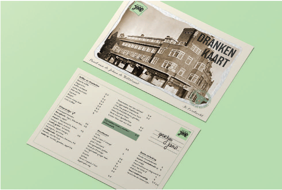
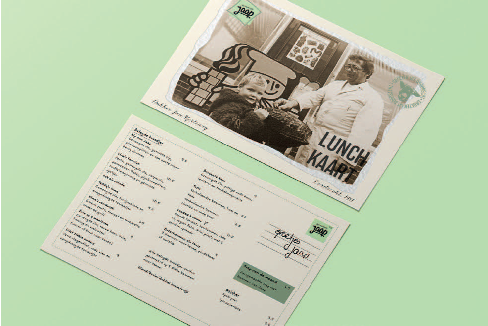
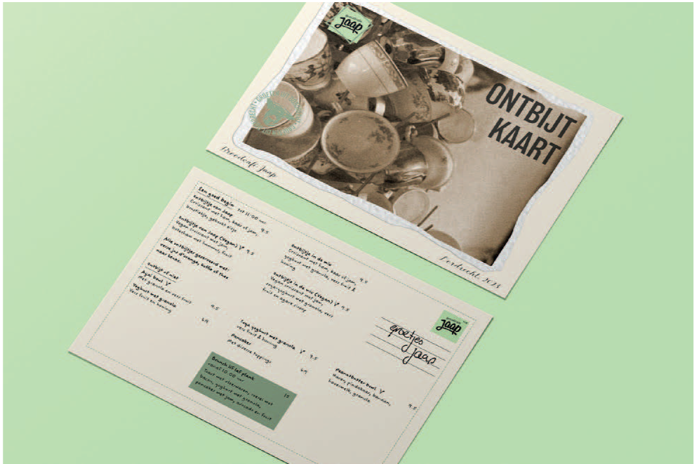
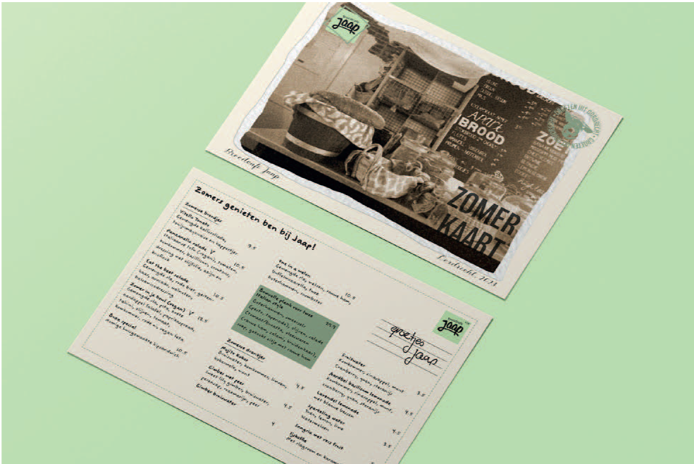
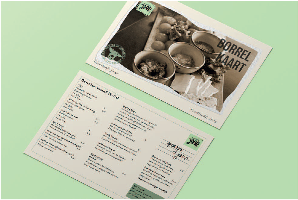
Mock-ups of the separate menu cards.
The final, printed menu.
This is one of the designs I’m most proud of and represents my design style the best. I was able to create something that is unique and clear, but not boring. It shows what the lunchroom stands for and has a nice personal touch that tells a story.

